
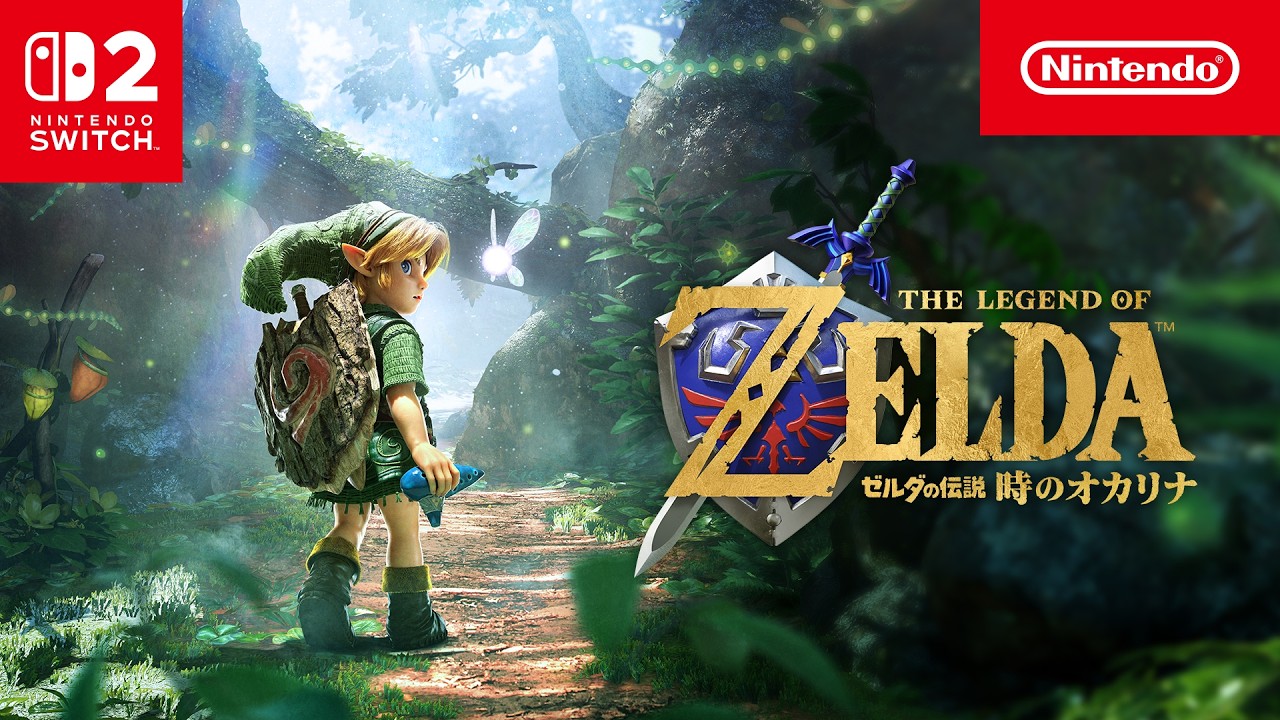
This art direction is unbelievably bad, IMO. I am shocked to seemingly be in the minority on this.
I completely agree. Looks like the typical fan remakes in Unreal engine. Absolutely no personality or charm in this art style.
I’m with you. Looks like marketplace art.
All of twitter is clowning on it youre not alone
Toddler Link look so bad. Feels like it was made with AI-Tools (I know it was probably not). It just looks uncanny and mismatched. Especially if you look at the rest of the characters and the game world.
The rest of the art direction looks fine.
I was thinking about it, and even though it’s ugly as hell, I wouldn’t mind if the characters looked consistent.
The kokiri look weird compared to the Hylian kids and the random NPC’s look more consistent with the n64 version.
Apparently the art director for Majoras mask tweeted about the game and said the design reminds him of Japanese puppetry which kind of sounds cool but now I feel like the style would have worked better in majoras mask because its so creepy lol
I’m off-put by child Link, too.
Missed opportunity to go super stylized with it. The new titles lean so far into realism, it makes me wonder what it would look like to try to evoke an N64 aesthetic with modern graphics power.


