
the good news: we’re now on the newest stable lemmy!
the bad news: federation feels a little off to me? sometimes this is a federation queue thing that resolves itself, sometimes it’s an indication of a problem.
things to test if you want to help out:
- see if you can see your posts on other lemmy and mastodon instances
- post here from other instances
- see if you can load communities, threads, and comments in non-local communities (this is a big one)
- see if you can load our communities from other instances and see up-to-date threads and comments
- make sure your own profile settings are as they should be
- if you aren’t getting email notifications and should be, let me know
I’ll push all my changes and post a full changelog once we know 0.19.12’s running stable!
Welcome back, and thank you for your hard work.
I dunno if federation works because I don’t give a flying toss about it myself, sorry!
I dunno if federation works because I don’t give a flying toss about it myself
Is that the feature that lures in funny idiots that can’t read the description of the purpose of this place and have to be banned for trying to turn it into debate club?
Oh, federation is broken, the thing that means strangers wander over here and think they’re allowed to just pop off with shit takes? Whatever will we do??
laugh and deride less :<
New Lemmy version: objectively does look sleeker and more modern
Me: I hate change 😠
But also everything looks… Slightly enlarged? And now things don’t fit in one row on my phone anymore where they previously did.
(I know, you can’t do anything about that, just shaking my fist at the sky)
it’s definitely slightly more modern (derogatory) but I don’t think I can agree on it being sleeker
the flashing grey spoiler-like thing it does to the text is quite annoying
But it’s got what progressive web apps crave… it’s got animations
Boop.
blorp
Nobody:
Absolutely no one:
Not a single soul on this earth:
Lemmy: Oh hey I know what the people want! A screen full of web-dev’s worst design sin of the 2010s every time they navigate back to the main page.
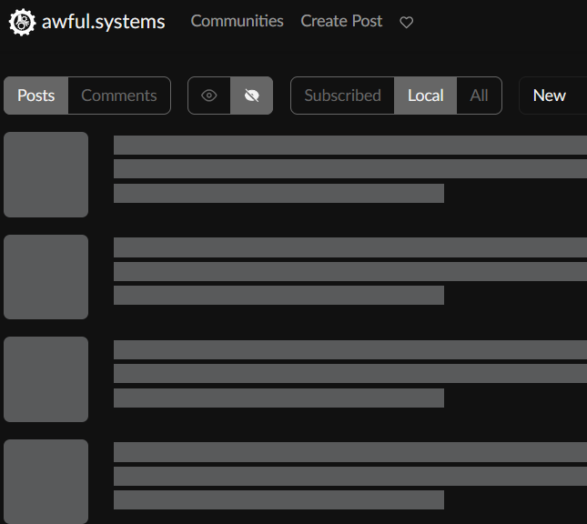
god somehow it’s even worse in the inbox — the whole thing turns to a gigantic placeholder every time you mark a post as read. it’s such a React problem for software to have
Urgh. Well, happy to learn that at least I’m not the only one who really dislikes that kind of design element.
an undetermined mystery: me refreshing my recent-comments feed (my default/home view) which had this post showing up also suddenly shifted font size
all hail the jank
(…I’ll try dig into it but also Fuck HTML Fuck Browsers (I’m not in the mood for applicable lemmy invectives))
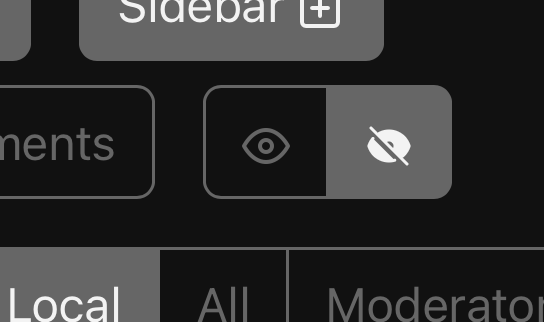
my lemmy came preconfigured for eyes? where we’re going we don’t need eyes
image description
one of the new buttons on the lemmy post list toolbar is a button cluster where one button is an eye logo and the other is a no eye logo and no eye is selected and I don’t know what that means